Bradford Tonic is an all natural health drink that was in need of a rebranding, so I decided to create a conceptual redesign. My focus was for the drink’s packaging to be clean and contemporary and for the packaging to reflect the medicinal identity of the drink, while remaining attractive to consumers.
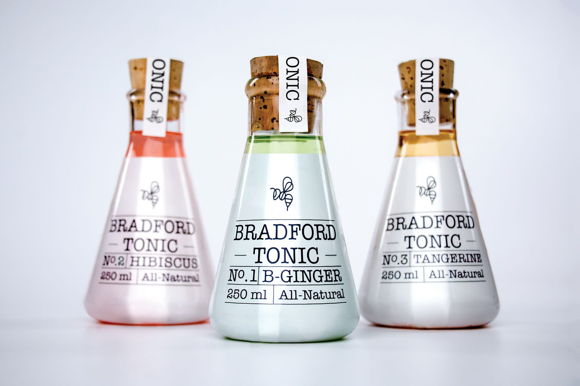
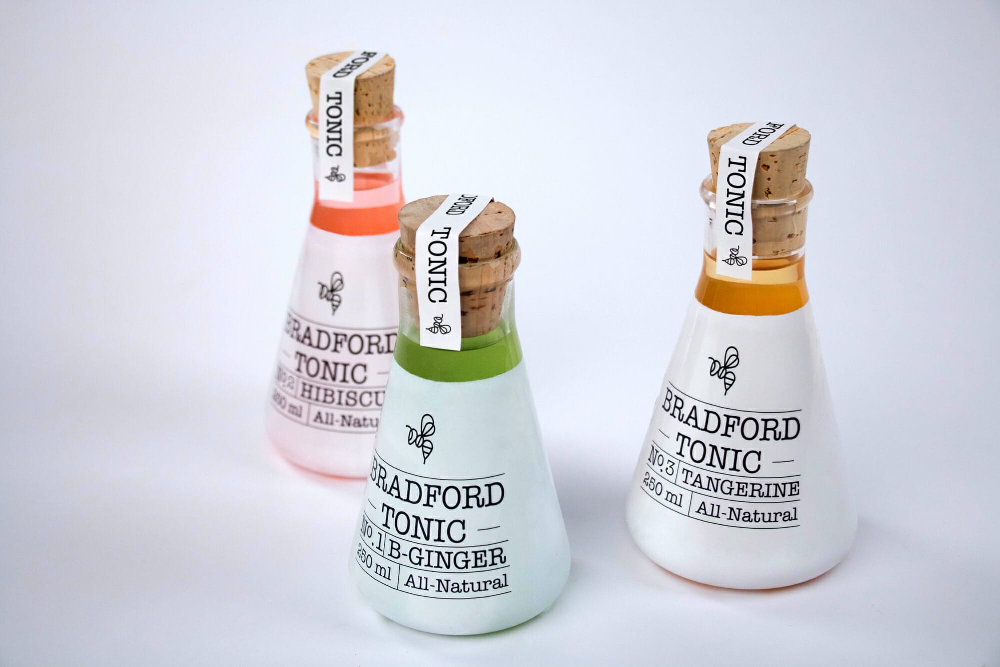
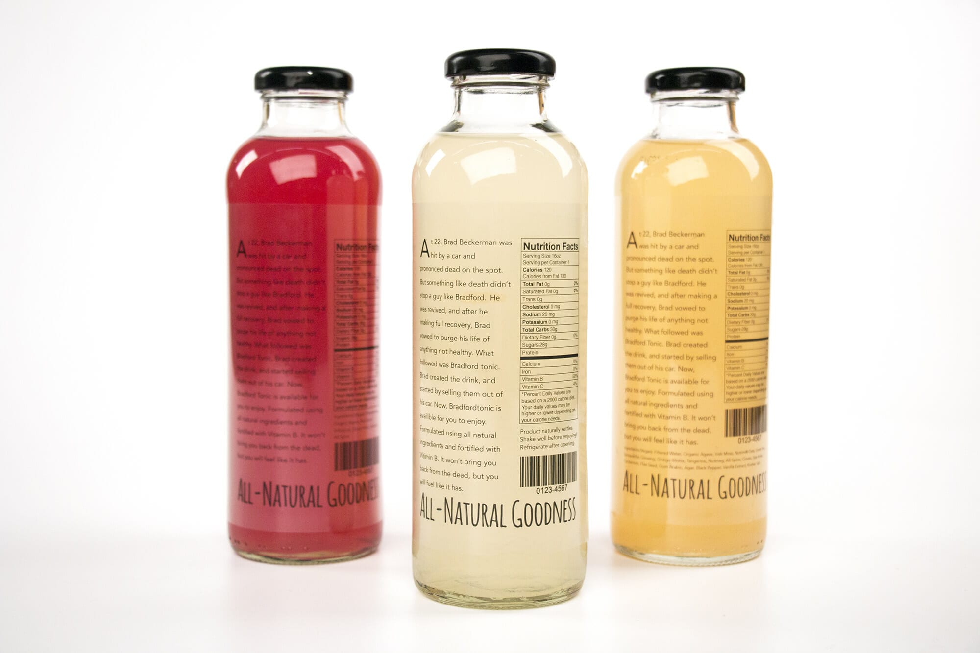
I chose a minimalist structure for the identity. I wanted to remove every unnecessary element while maintaining the brand’s essence. I kept the bee as the basis for the new logo as an homage and to establish continuity. I considered several different forms before settling on an Erlenmeyer flask for the bottle. I painted the flasks a glossy white, while leaving a portion of the top clear, in order to show off the colors of the drinks.
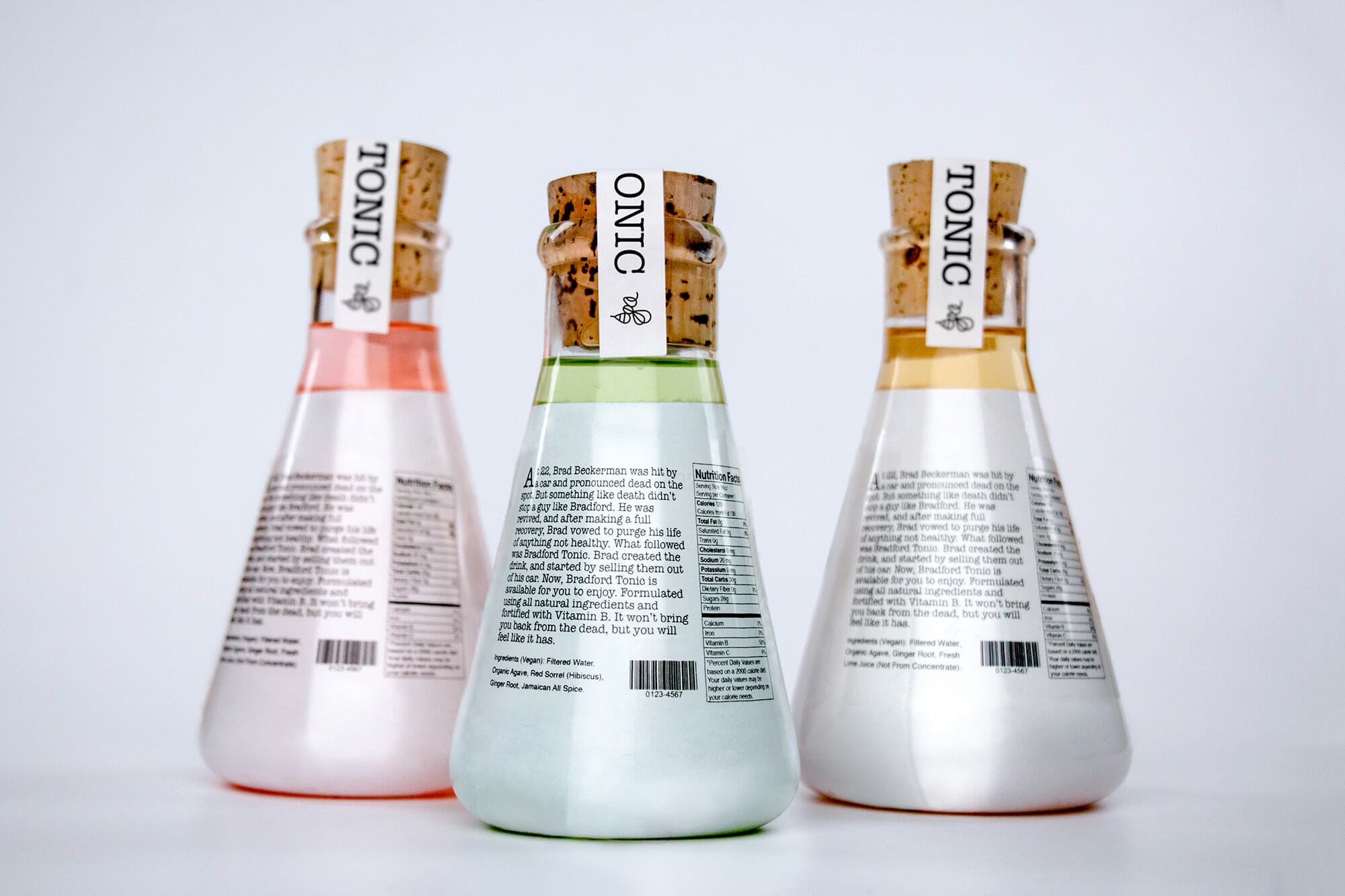
When researching the product, I found out that the creator had come up with the idea for the drink after being hit by a car and revived from death. I thought that this made an interesting story, and decided to include it on the back of the drink’s packaging.
American Advertising Award: Inland Empire Student Competition | 2017
Bronze Award: Packaging
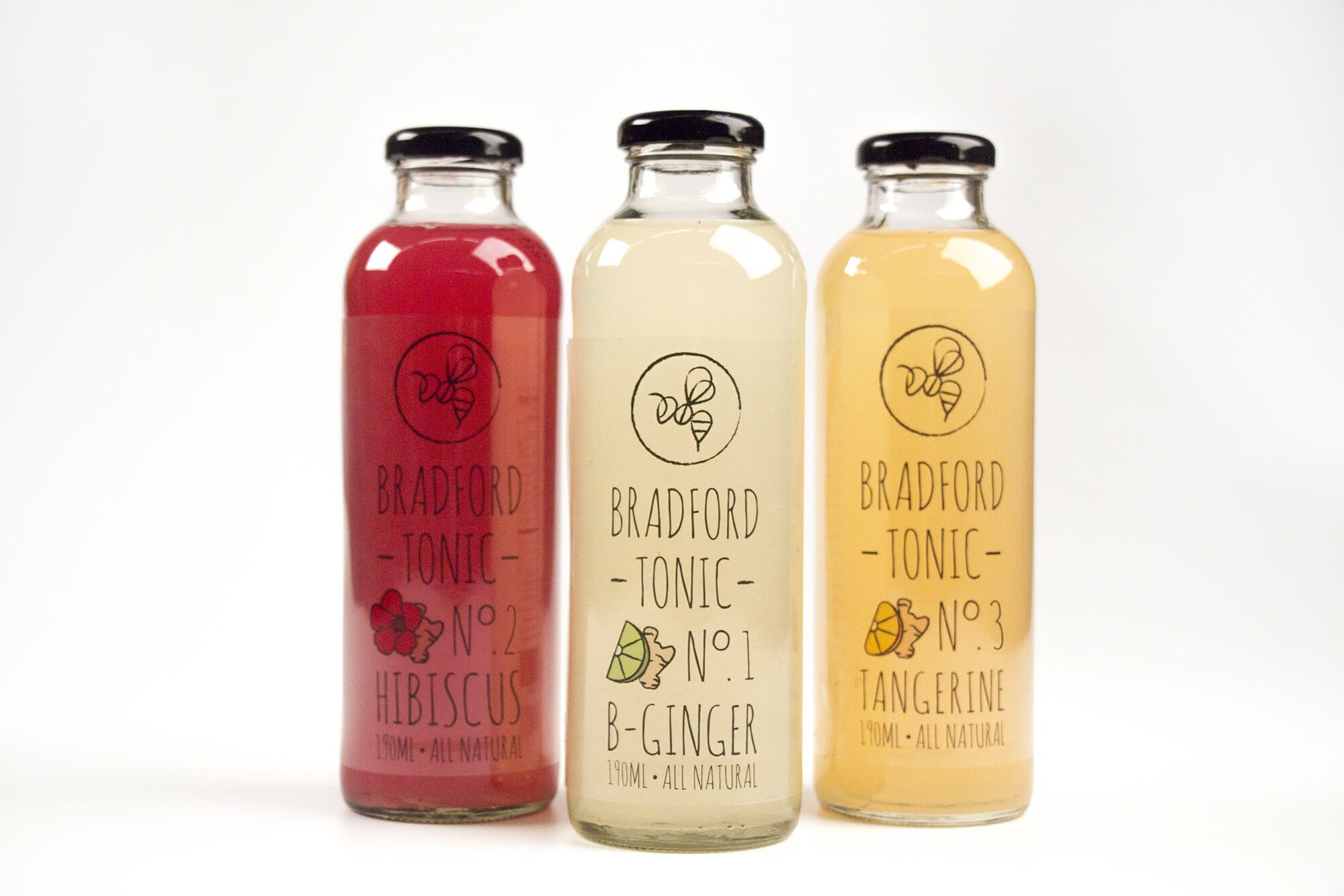
Early Designs
These are some early mockups I made prior to choosing the Erlenmeyer flasks.
The front of an early mockup The back of an early mockup
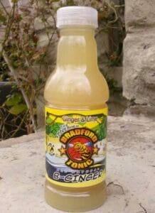
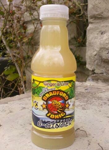
Original Design
Designer Unknown.
Original Packaging Original Logo
Previous ProjectNext Project
- Categories:
- Share Project :